Magazine cover
Select spreads
plant parenthood
Editorial design
Background: plant parenthood is a magazine that releases quarterly, seasonal issues. The magazines include articles that have information about all different types of plants that are “in-season” at the time of the issue’s release and give tips and ideas to help foster people’s interests in developing their green thumbs and gardens.
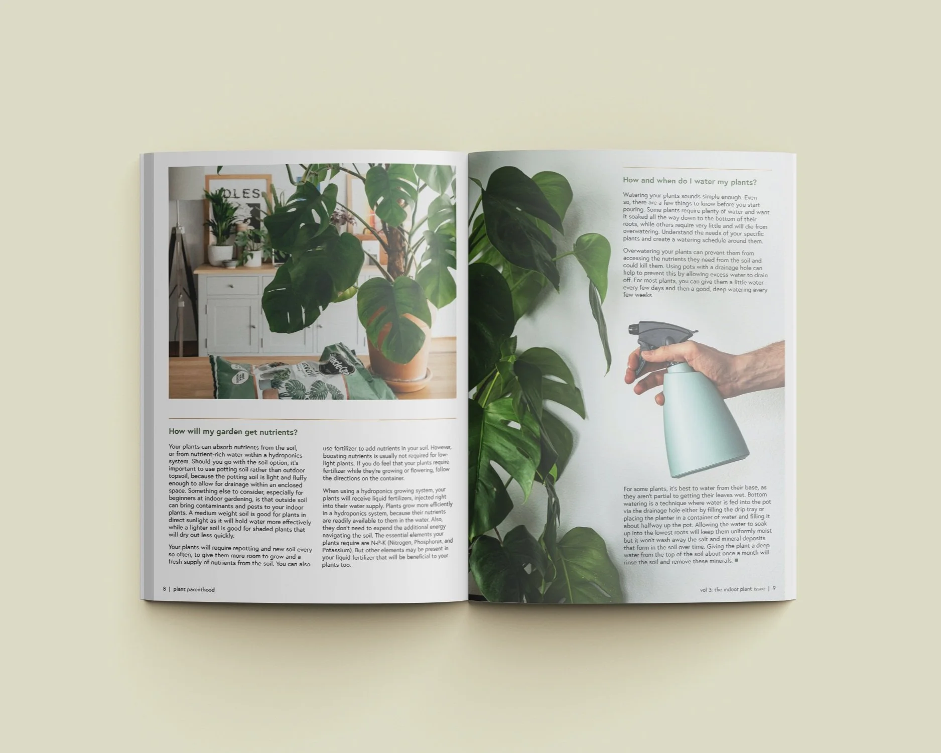
Problem: The goal of the project was to design a magazine cover and spreads that are visually appealing and present the information in a way that’s interesting and easier for the audience to digest.
Process: Since the designs were focused on indoor plants, I looked up different articles geared towards beginners to get ideas for what article topics could be featured in the magazine. After compiling content from my research, I edited the copy and also looked for images on unsplash.com that could pair with the information that I gathered. I also used Pinterest and referenced magazines/catalogs that I had to get ideas for the magazine layouts. Once designing in InDesign, I started designing each page by creating grids on each spread. To try to create some variety in the layouts, I either adjusted the number of rows and columns so that it was different from the spread before or after or used the same grid system but tried to layout the images and text in a slightly different way.
Solution: The magazine spreads all use high-quality, large images, lines, and 1-2 columns to organize the copy of the article and make it visually interesting and easier to digest. Similar to the cover, where I used lines to create a grid layout for the article titles, I used rules and the images to create a grid layout within the spreads. For the magazine title, I selected Cooper Std Black because its bold, slightly rounded characteristics made it noticeable but still friendly or approachable. For all of the spreads, I used 2 weights of Europa because I wanted to keep a clean, modern look to the magazine.
Software: InDesign


